Psychology of colors in architecture

- The psychology of red
character:
Exciting and stimulating
Positive: emotional, warm, enthusiastic, active, strong
Negative: hard and intense, aggressive, angry, greedy, blood-colored
Red is the most dominant and dynamic color among colors. The eye must focus on the color when looking at it because the natural focal point of red is below the retina.
This is why red looks closer to you than it is.
Red color in architecture
Ceiling: disruptive, imposing, heavy
Wall: Aggressive and progressive
Floor: vigilance and warning

- The psychology of the color orange
character:
Exciting, stimulating, comforting
Positive: cheerful, lively, energetic, outgoing
Negative: unread and hard and severe
Orange is less intense and solid than red. Orange has few negative characters. However, if it is used in the design in a low-color and low-saturation way,
it may look cheap and low-spirited.
Orange color in architecture
Ceiling: Exciting and stimulating, demanding attention
Walls: warm and bright
Floor: active, movement oriented
Psychology of colors in architecture

- The psychology of yellow
character: consoling
Positive: sunny, happy, bright, lively
Negative: self-righteousness and self-centeredness, bright and showy
When the yellow color is pure, it is the happiest of all colors. Yellow color reflects warmth, happiness and inspiration and is a sign of enlightenment and communication.
Yellow color in architecture
Palate: bright (towards lemon), bright and stimulating
Walls: warm (towards orange), arousing (highly saturated)
Floor: Uplifting, uplifting and entertaining

- The psychology of green:
Character: Secluded and relaxing
Positive: calm, invigorating, relaxed and natural
Negative: Ordinary, boring, guilty
Unlike red, when we look at green, the focus of the eye is exactly on the retina, and for this reason, green is the most relaxing color for the eyes.
Green can be a symbol of nature and unhappiness.
Green color in architecture
Roof: protective, its reflection on the skin may seem unpleasant.
Walls: cool, safe, calm, confident, passive, exciting and stimulating when bright
Base: Natural (if not too saturated), soft, soothing, cool and cool (if leaning towards blue).

- The psychology of blue
Character:
Secluded, aloof and relaxing
Positive: cool, calm, moderate, moderate, safe, comfortable and genuine
Negative: scary, disappointing, sad, cold and melancholy
The blue color looks bright, clear, moist, cool and relaxing. Unlike red, this color reduces heart rate and blood pressure.
Blue color in architecture
Ceiling: Astronomical, cool, retreating (if pale), heavy and uncomfortable (if bold).
Walls: cool and non-intimate (if pale), stimulating, encouraging and give depth to the space (if bold).
Floor: A promising sense of ease and simplicity (if pale), compelling, real, hard, substantial, and substantial (if bold).

- Psychology of violet and purple color
character:
Overcoming, controlling, restraining
Positive: dignified, big, high-ranking, exclusive, unique, expensive
Negative: lonely, sad, boastful, conceited, pride
Violet or purple is a combination of red and blue (two colors that are psychologically very opposite to each other).
Purple can appear delicate, sensitive, pleasant and charming or chaotic, confused, decadent and lost.
The use of purple color in architecture
Ceiling: confusing, confusing, overwhelming, humiliating
Walls: heavy, irresistible
Floor: ephemeral, mortal, magical

- The psychology of pink
Character:
Vibrant (bubblegum pink), Relaxing (pale pink)
Positive: lively, relaxing, private, intimate
Negative: Too sweet, weak and weak
The psychology of pink color in architecture
Pink color in architecture
Ceiling: sensitive, delicate, relaxing
Walls: prevent violence, confidential, intimate, very sweet
Bottom: very fine, rarely used.

- Psychology of brown color in architecture
Character:
Overpowering, subduing, controlling
Positive: warm, safe, stable
Negative: uncomfortable, heavy, hard
There is a very big difference between brown color and wood color.
In institutions and organizations, you should avoid using brown color,
because it will have adverse effects. On the other hand, stone and wood look very warm and comfortable.
Brown color in architecture
Ceiling: uncomfortable, painful, hard, heavy and difficult
Walls: safe and secure if it is wood, and if it is paint, these feelings will be less.
Floor: fixed, stable

- The psychology of white
Character:
Indifferent, indifferent
Positive: clean, fresh, bright
Negative: empty, empty, useless
Although white color is one of the most widely used colors in indoor and outdoor spaces in various applications,
there are many reasons and justifications for not using white color as the main color in a space and structure.
White color in architecture
Ceiling: empty, helping to diffuse light sources and reduce shadows
Walls: neutral, sterile, without energy
Floor: anti-touch

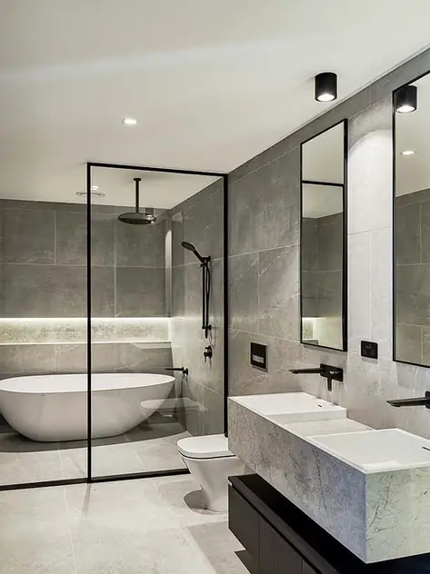
- The psychology of gray
Character:
Neutral towards peace and quiet
Positive: Neutral
Negative: Boring
Gray color has very limited psychotherapeutic applications. Hence, the current fashion and style in using it on the walls is reasonable and logical.
Gray color in architecture
Roof: shaded
Wall: neutral and boring
Floor: Neutral

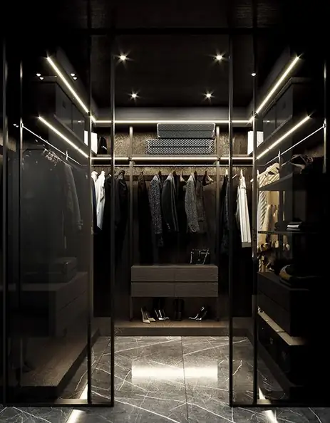
- The psychology of black
Character:
Positive: deep and abstract
Negative: ominous, bad, unlucky
Black is often associated with oppressive power, darkness and the unknown. In architecture, it is often used to create space and specific and
separate points, such as the exit and entrance of ventilation systems.
Psychology of black color in architecture
Ceiling: hollow
Walls: ominous, prison-like
Floor: strange, strange, abstract

Psychology of colors in architecture
Colors in Decoration , Home decoration in Turkey , Decor in Istanbul , Interior decorating in Istanbul , Interior style

